Client
Salling Group
A popular entry price brand with a range of more than 250 products
Discount and proud of it
Deliverables
Concept and Brand Development
Visual Identity
Recognitions
Creative Circle Award 2020
– Shortlist in best food packaging design
Discount is often associated with poor taste, inferior quality and ugly design. Salling Group (previously Dansk Supermarked) Budget range was no exception, its design proving unpopular with customers. By adopting a brand new design and approach, Salling Group has reinvented its Discount brand.
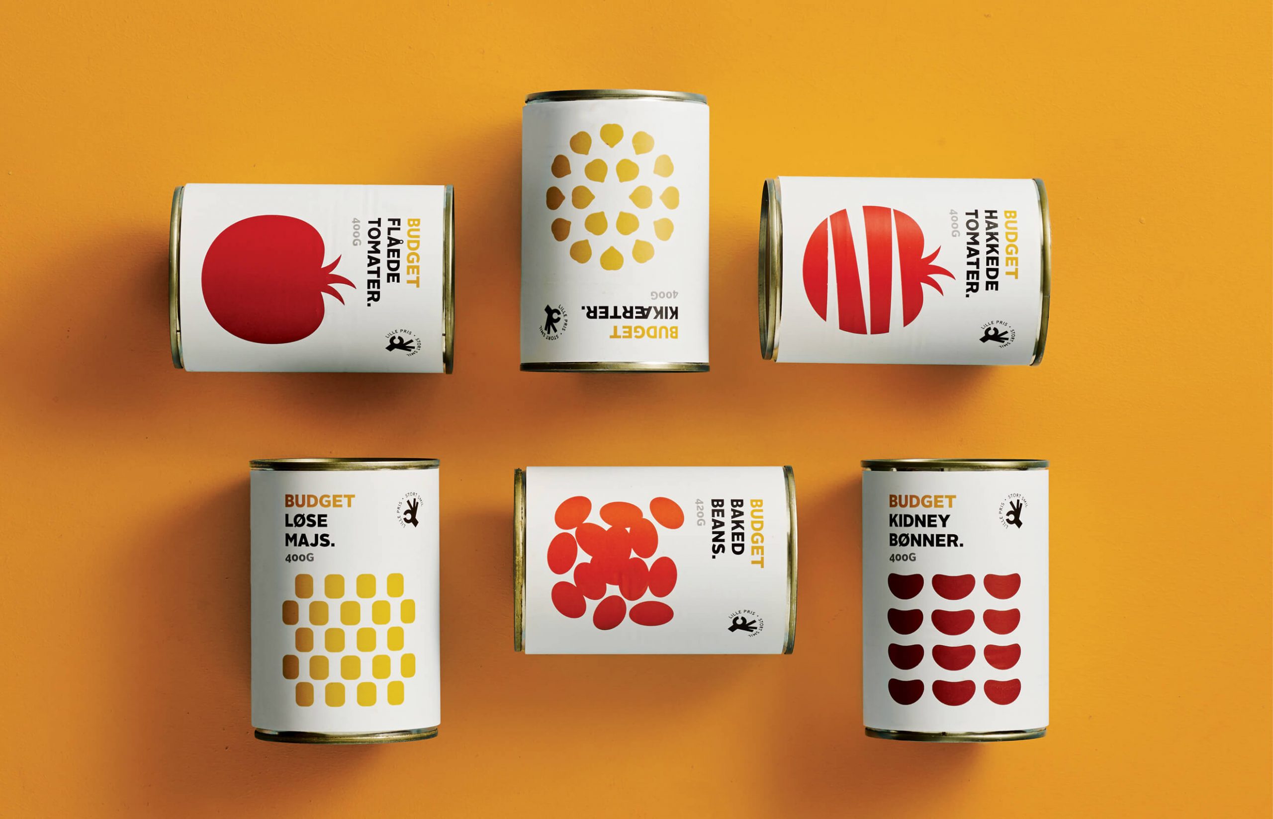
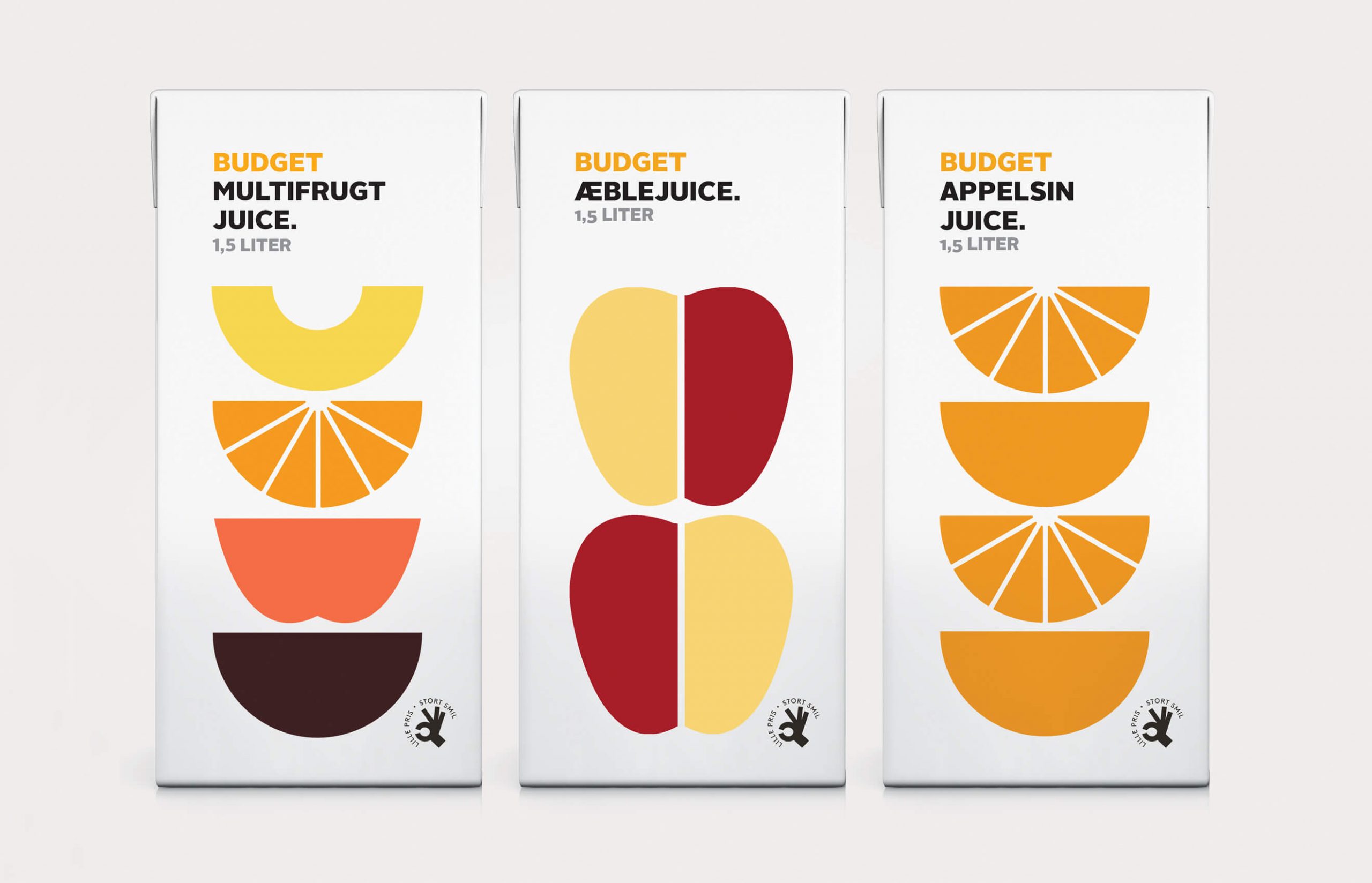
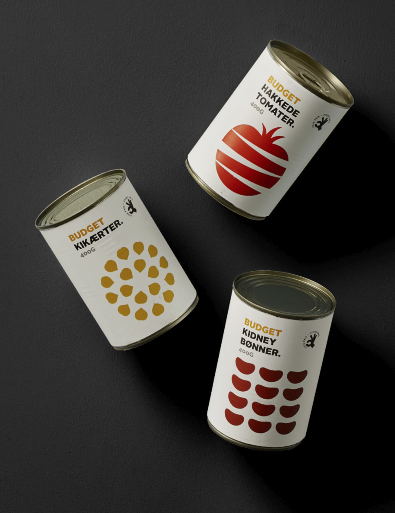
Essentially, Discount is about offering staple foods at affordable prices and the new design had to communicate this message to consumers. Simply has created an extremely minimalist look where content is solely communicated using icon style
illustrations. The design’s no-nonsense appearance makes it easy for customers to recognise the products whose distinctive style causes them stand out from all others on the market. All the products have the same white background. To provide contrast, each icon has its own clear colour. Photographs and other design elements have been omitted from the packaging design. Instead, each variant features an icon and three colours. And a small logo has been added to emphasise the discount price message. Discount doesn’t have to be dull. It can also be communicated in a fresh, modern, playful – and above all – eye-catching way.

Discount doesn’t have to be dull. It can also be communicated in a fresh, modern and playful.
