Client
Irma
Known and loved by all Copenhageners
An icon for the future
Deliverables
Packaging Design
Recognitions
Creative Circle Award nomination 2016
– packaging design
Irma is an institution in Copenhagen. The chain is the world’s second oldest functioning supermarket chain, known and loved by all Copenhageners. Irma sells staple goods with an extra twist and commands a strong market position in the organic segment and in terms of food quality. So much so in fact that the chain’s own brand – Irma’s – is one of the main reasons why customers choose to shop in its stores.
The task of modernising the brand therefore demands the greatest care and attention to detail. In collaboration with the advertising agency Konstellation & Republica, Simply
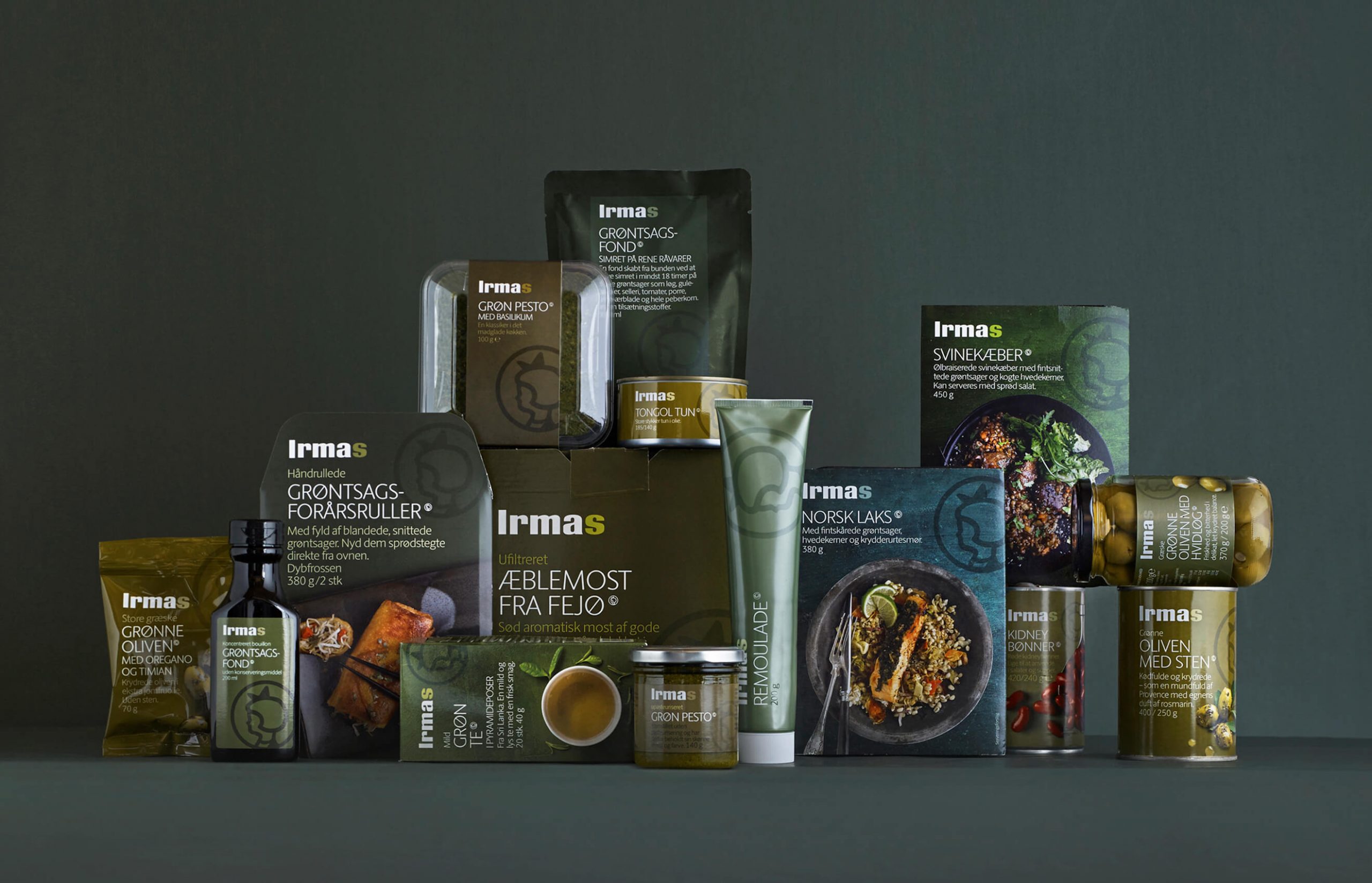
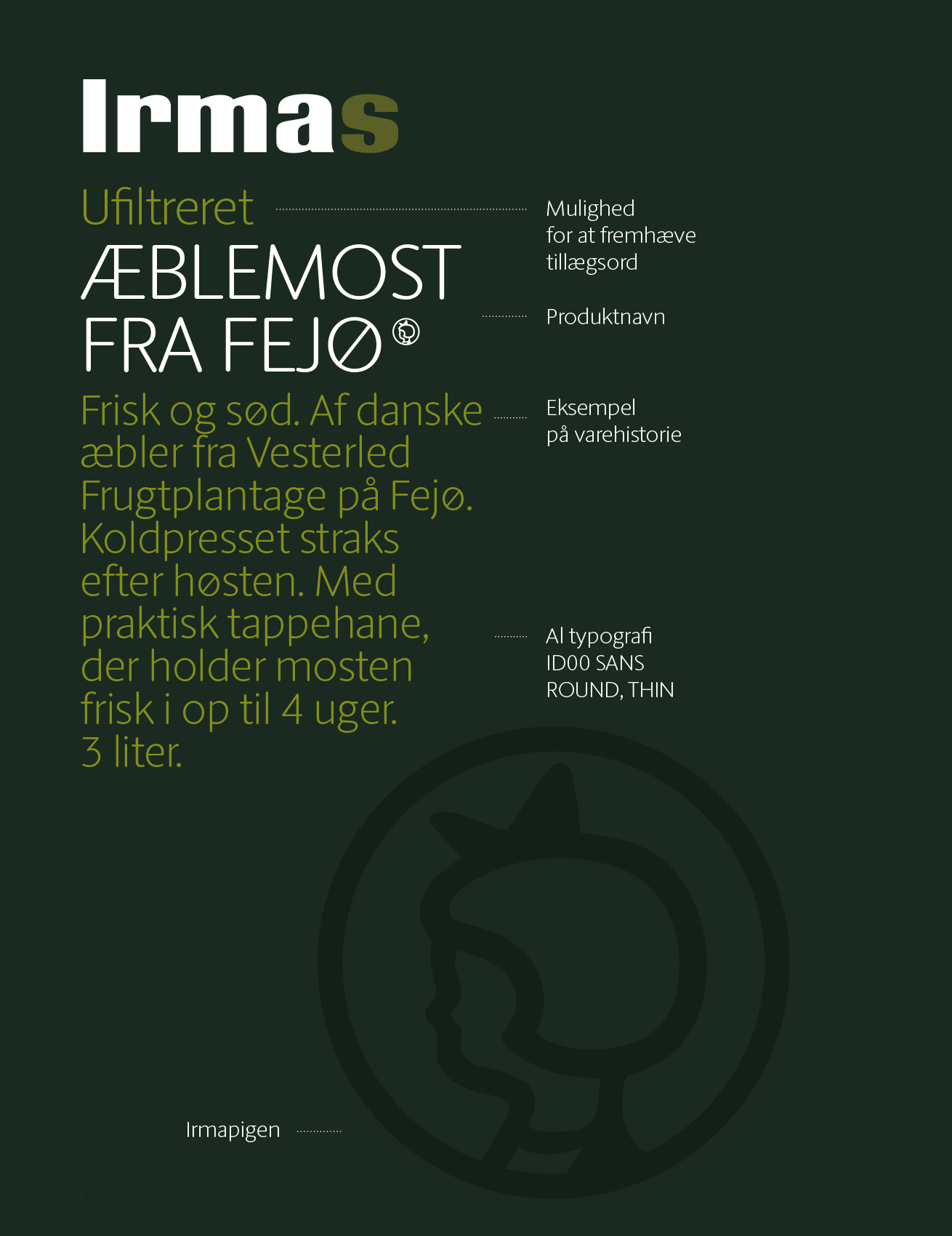
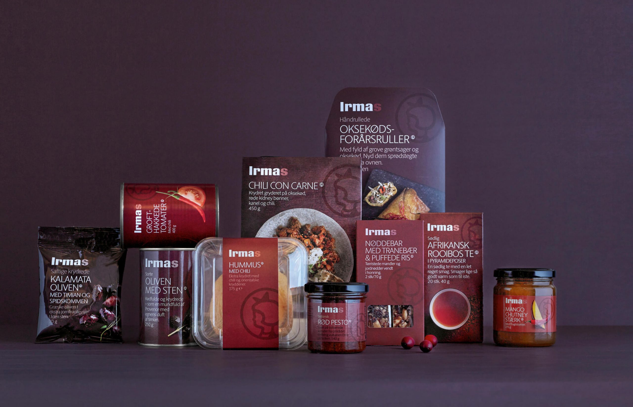
developed a new packaging concept aimed at simplifying and streamlining Irma’s packaging. Niche brands were done away with. All Irma’s characteristics – and not least the iconic Irma girl – were strengthened. The good product stories normally on the back of the products were given prominence on the front of the packaging. The image style and colours were updated.
Everything was built up around a fixed model that enables the chain to expand the range for years to come without the need to change the fundamentals and balance of the design.

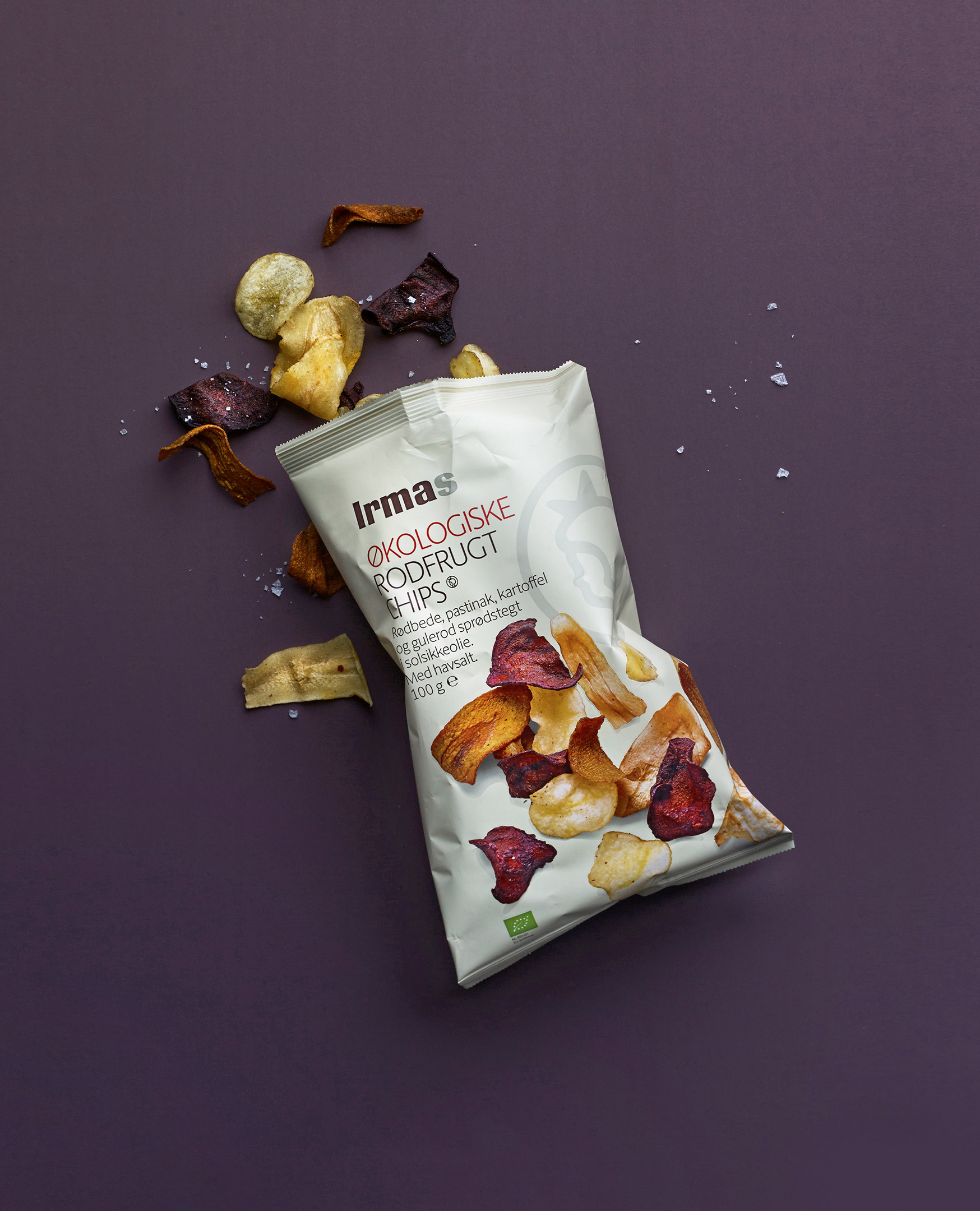
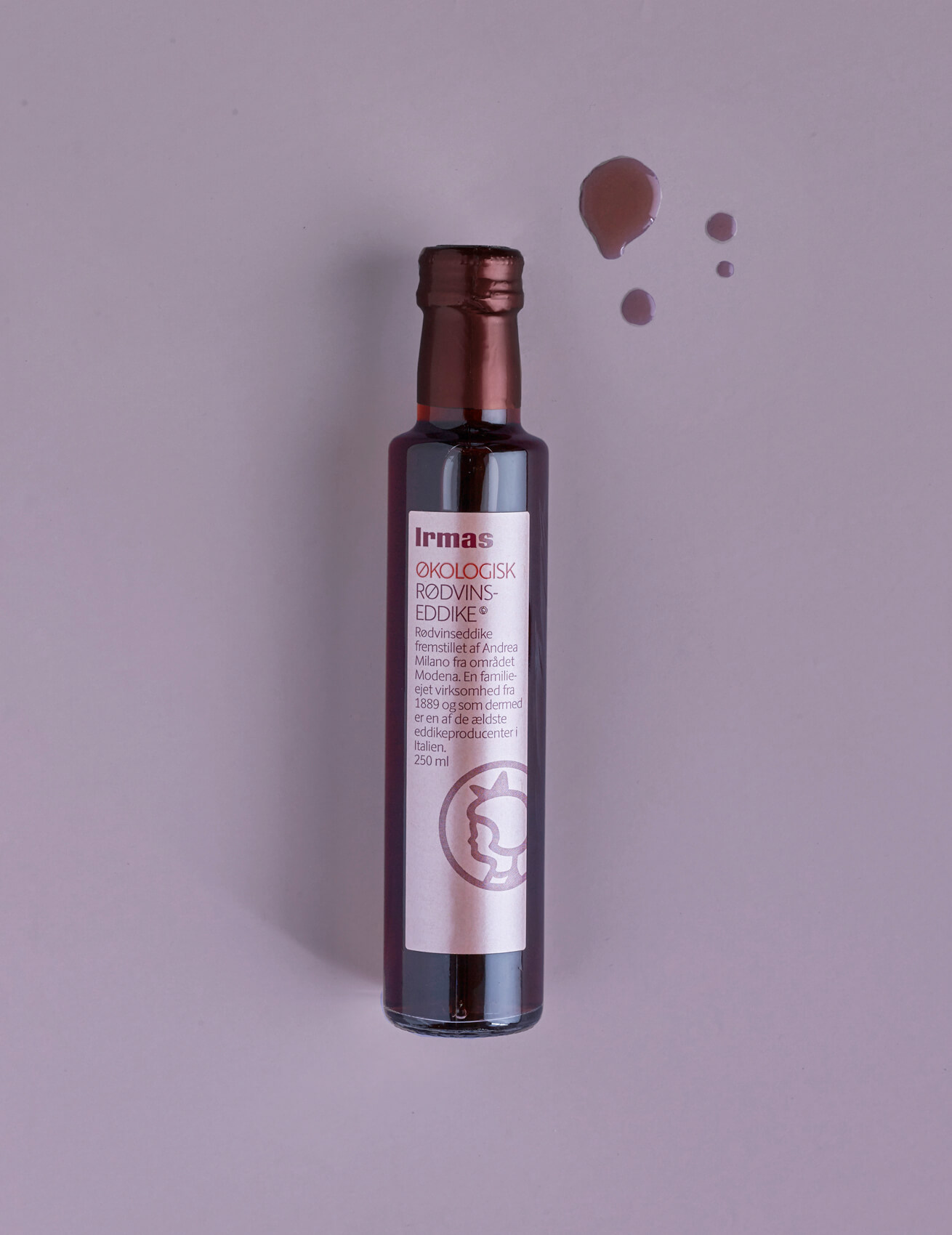
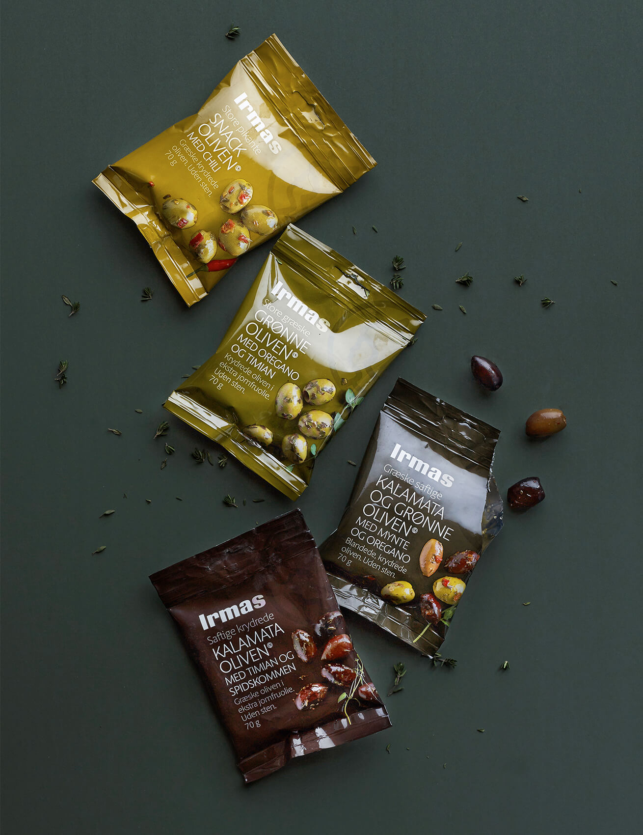
All Irma’s characteristics – and not least the iconic Irma girl – were strengthened.
