Client
Bolcheriet
A local institution with open workshops where visitors can follow the creative process
Sweet fun in a new shape
Deliverables
Packaging Design
Visual Identity
Recognitions
Creative Circle Award 2015
– Best food packaging design
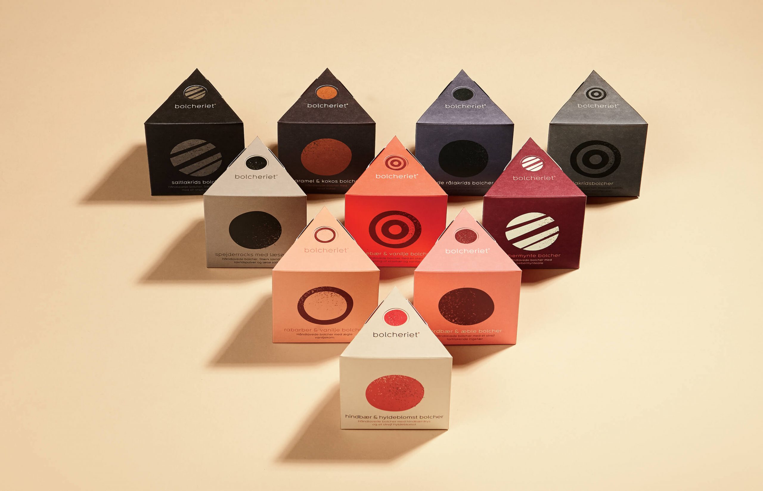
Familiar to anyone who has visited two of Denmark’s most popular holiday towns, namely Løkken and Skagen, Bolcheriet manufactures handmade sweets and toffees in open workshops where visitors can follow the creative process. Here, the atmosphere tends to be lighthearted and entertaining. The company is now launching a new series of sweets and toffees with a special emphasis on organic ingredients, natural flavours and new taste sensations. The product design is inspired by the wide variation in production, where sweets of all shapes and colours are produced the same day and where no two days are alike. Bolcheriet’s previous single logo has now been replaced with a range of different, alternating circles that combine to form a dynamic symbol. All the circles sport different colours and patterns, like the sweets themselves.
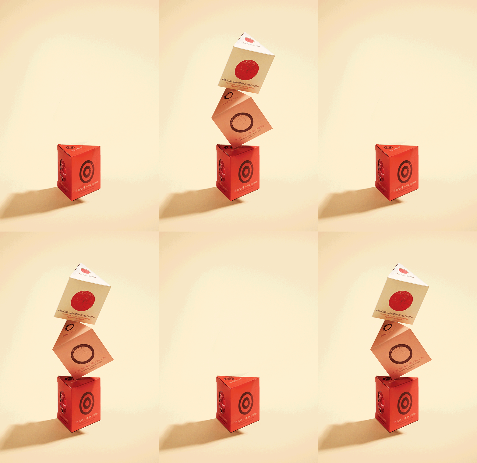
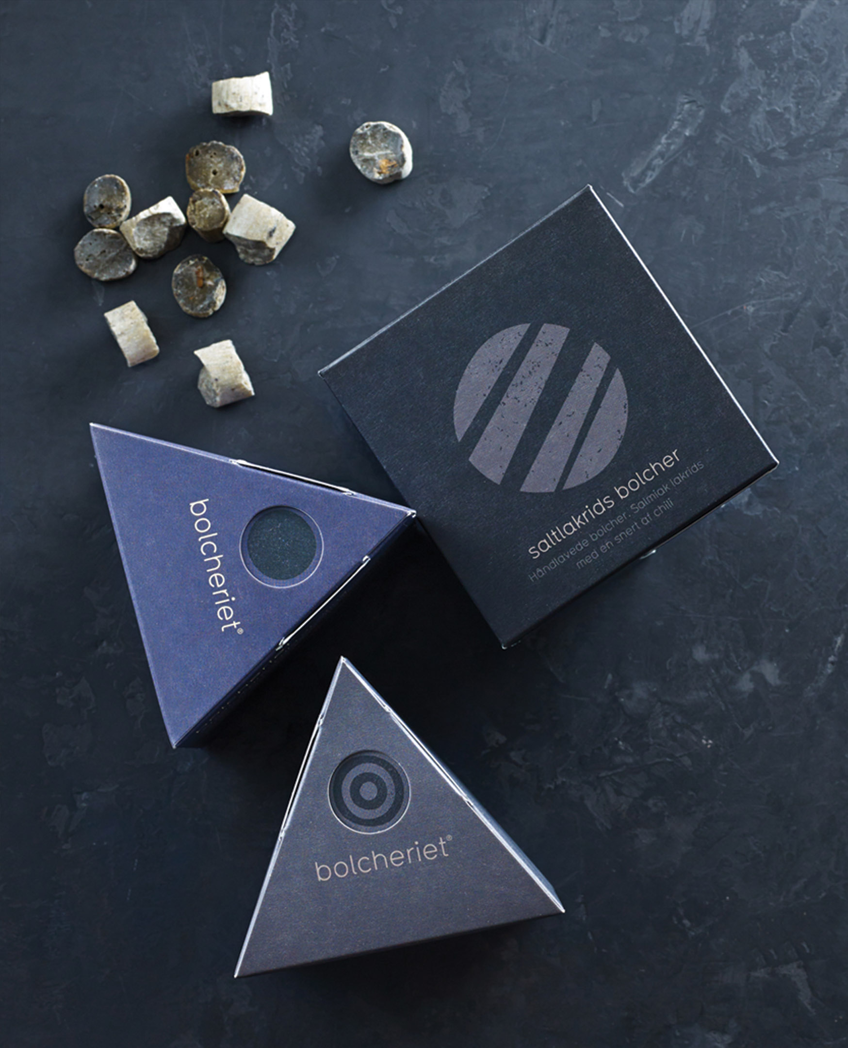
The box features a completely new design. The triangular shape is inspired by the so-called ‘sea markers’ found on the beaches at Løkken and Skagen. Previously used in Bolcheriet’s logo, the sea marker provides a link to the new design. The triangular shape offers an extra facing, enabling the product to be glimpsed while inside the box. Similarly, the triangular shape offers new possibilities for exposure at sales outlets, where the boxes can both be stacked and arranged in decorative formation. As a further detail, the box is equipped with an innovative opening mechanism – a single touch of the sweet illustration allows you to insert a finger and lift off the box top. The box is assembled without glue.
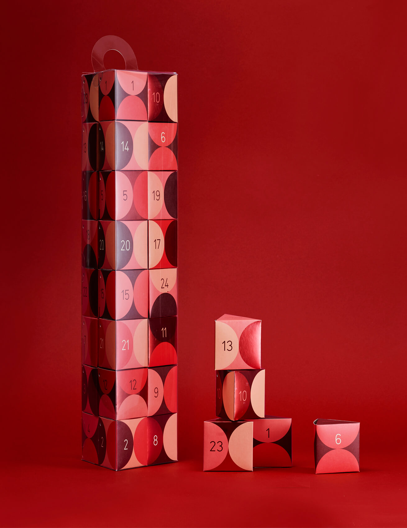
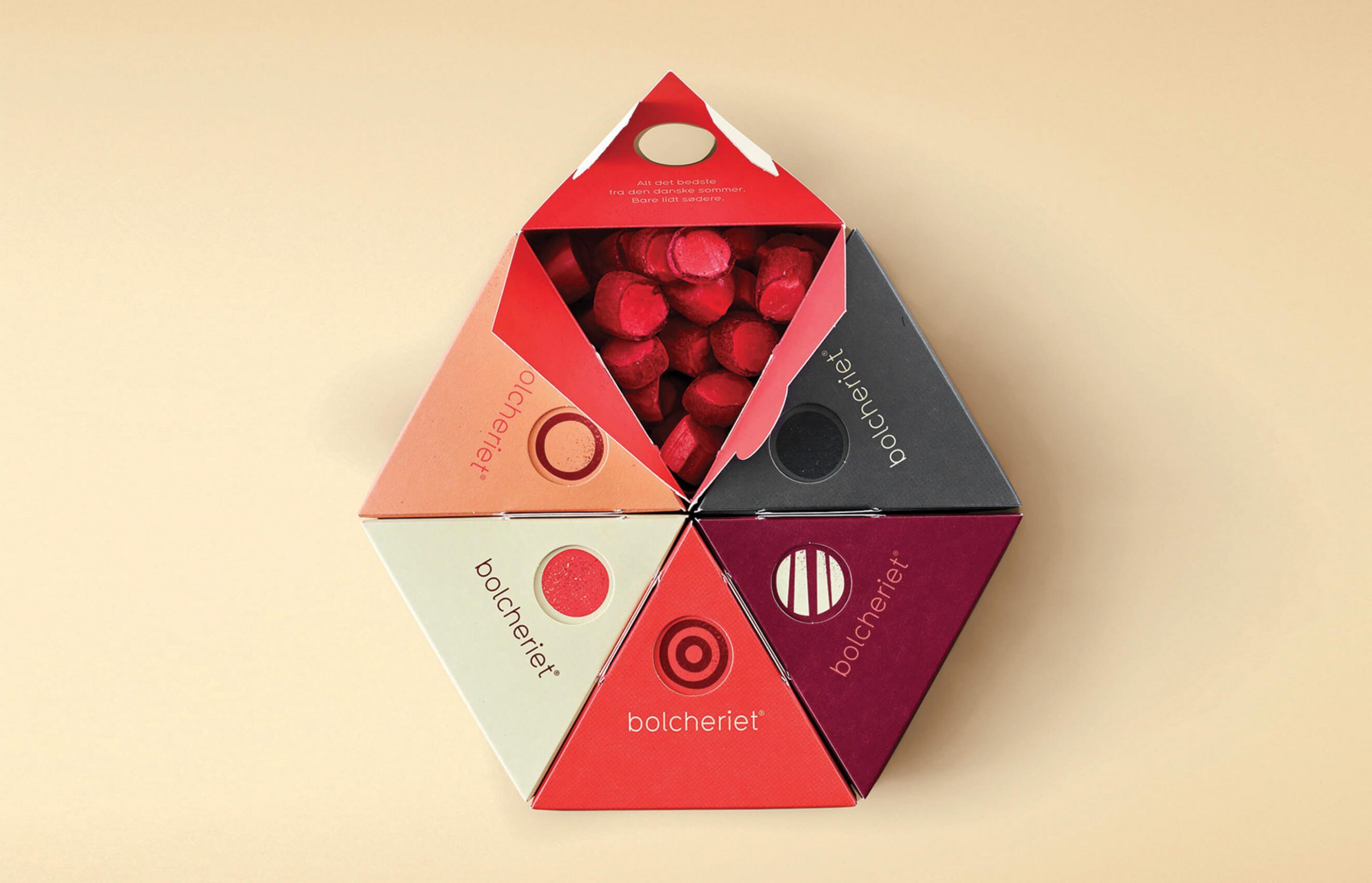
The triangular shape is inspired by the so-called ‘sea markers’ found on the beaches at Løkken and Skagen. Previously used in Bolcheriet’s logo, the sea marker provides a link to the new design.
