We develop and grow corporate and product brands
Simplicity is a powerful tool. It's our strategic approach and creative ideal. It calls for self awareness and the desire to understand who companies are and what they deliver of importantance to their customers. Simplicity is a sign of confidence, and what inspire confidence in others.

Simplicity is no accident, its a strategy where knowing who you are only is half the job; knowing who you are not is just as important. It’s the basis of how you begin to simplify your brand, or your product, in order to deliver that less-complicated experience and impact.
Every project begins with a collective understanding of the essence and ambition of the brand. We keep everything upfront and personal together with the brand owners and key stakeholders.
Read more about how we grow and simplify brands
How can we help grow your brand?
We are trusted advisors to large indutry leaders, as well as small local producers. We are fluent in corporate branding and identity, across businesses, from financial corporations, renewable energy, turism - to high street retail brands.

Brand Audit & Workshop
Identifying your brands assets, key differentiators and potential renewed brand impact through curiosity, inspiration and dialouge.
Brand Development
Creating your brand from scatch or re-vitalizing an existing. Building a position on industry and costumer insights, naming strategy and visual identity.
Brand Communication
Bringing the brand to life through storytelling. Purpose, communications strategy, brand book, design manual, execution across psycical spaces and mass media.
Selected work for some great brands
Let's fix the future
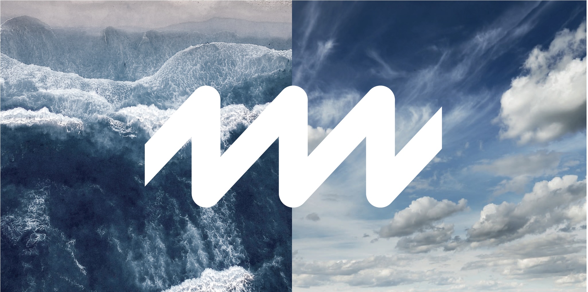
Momentum Green Energy
Deliverables
Brand Strategy
Purpose & storytelling
Corporate visual identity
Digital design
Momentum Energy Group A/S is an international asset manager, developer and investor in wind and solar energy. Based in Denmark, they support Danish and international investors in all key markets in Europe.
Momentum is rapidly growing and in order to truely reflect and mirror its core services and contribution to investors as well as society, we were asked to develop and calibrate the companys brand platform, purpose and corporate visual identity.
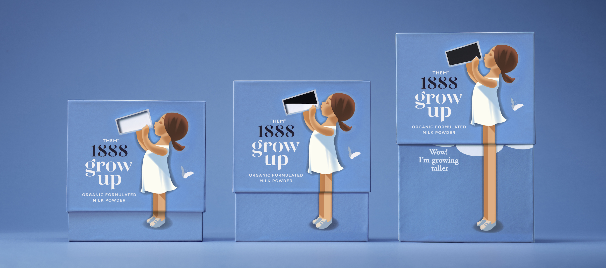
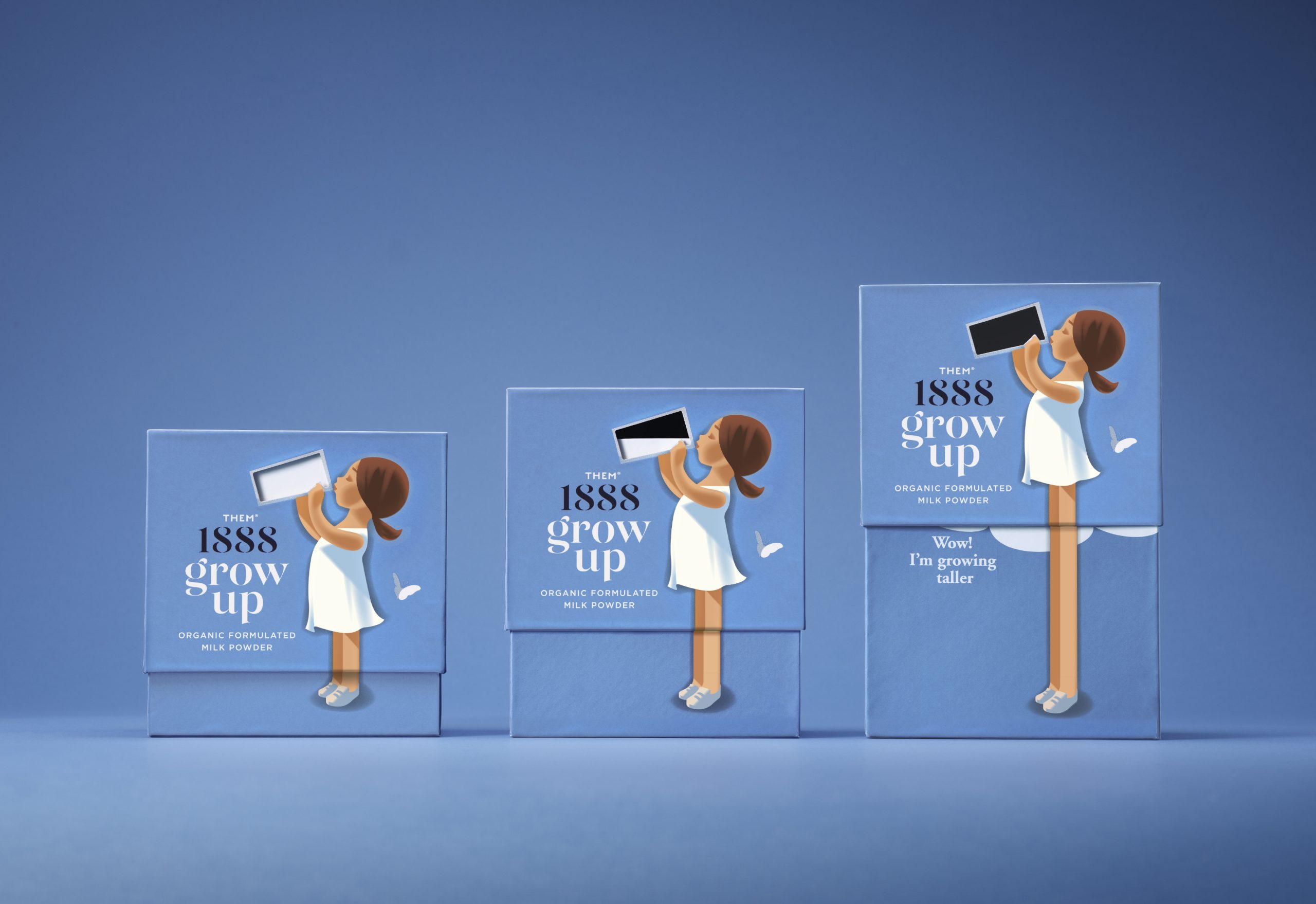
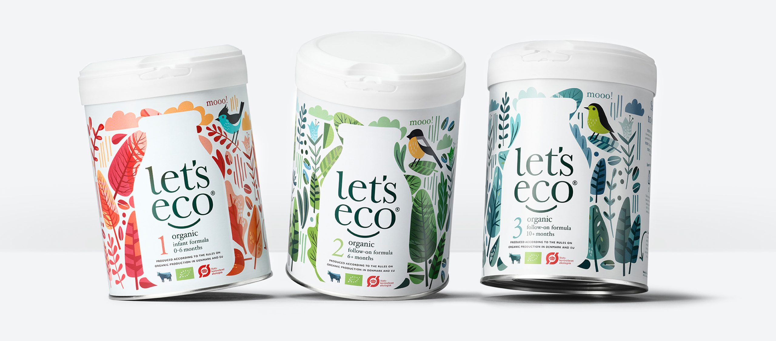
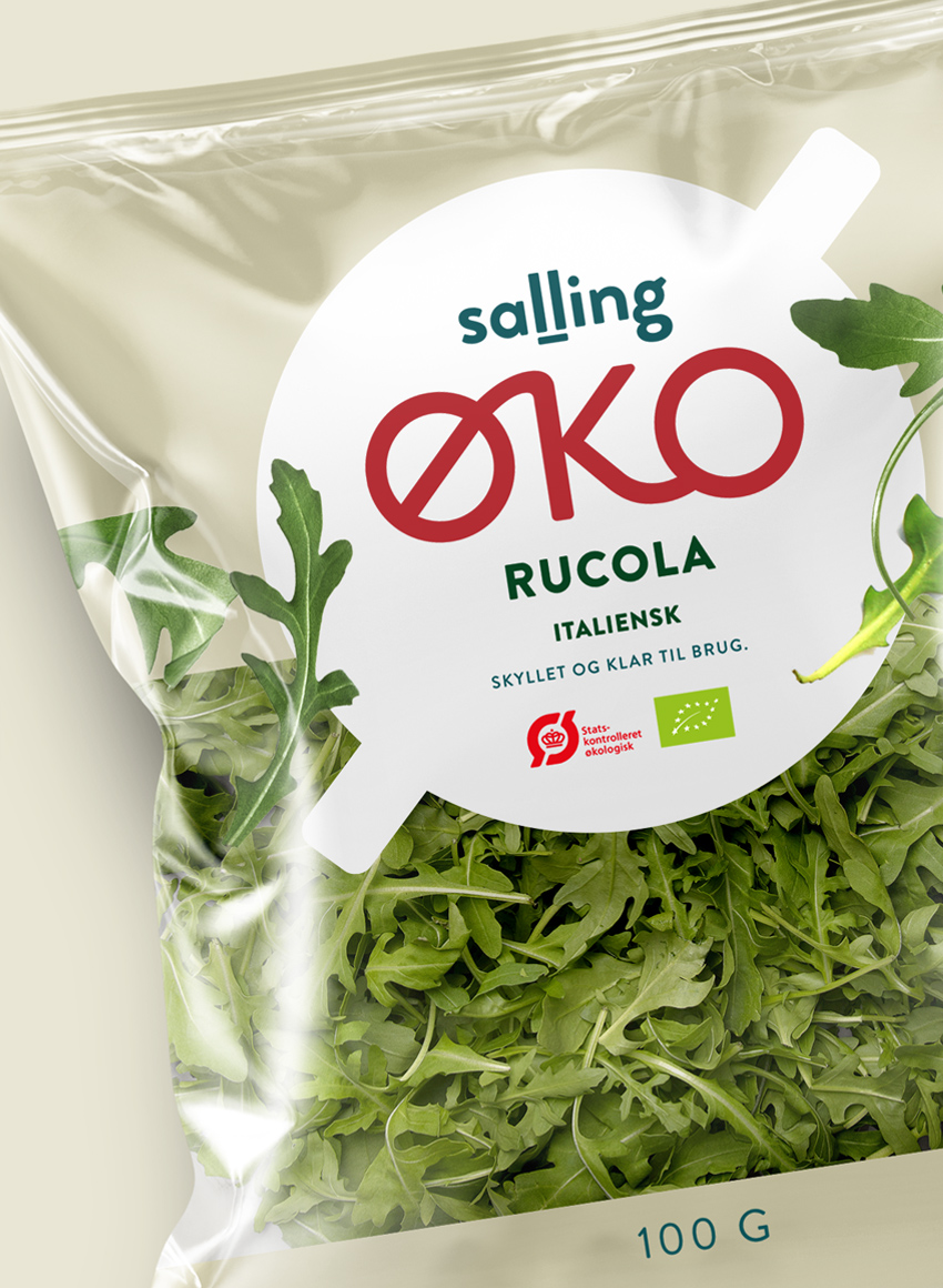
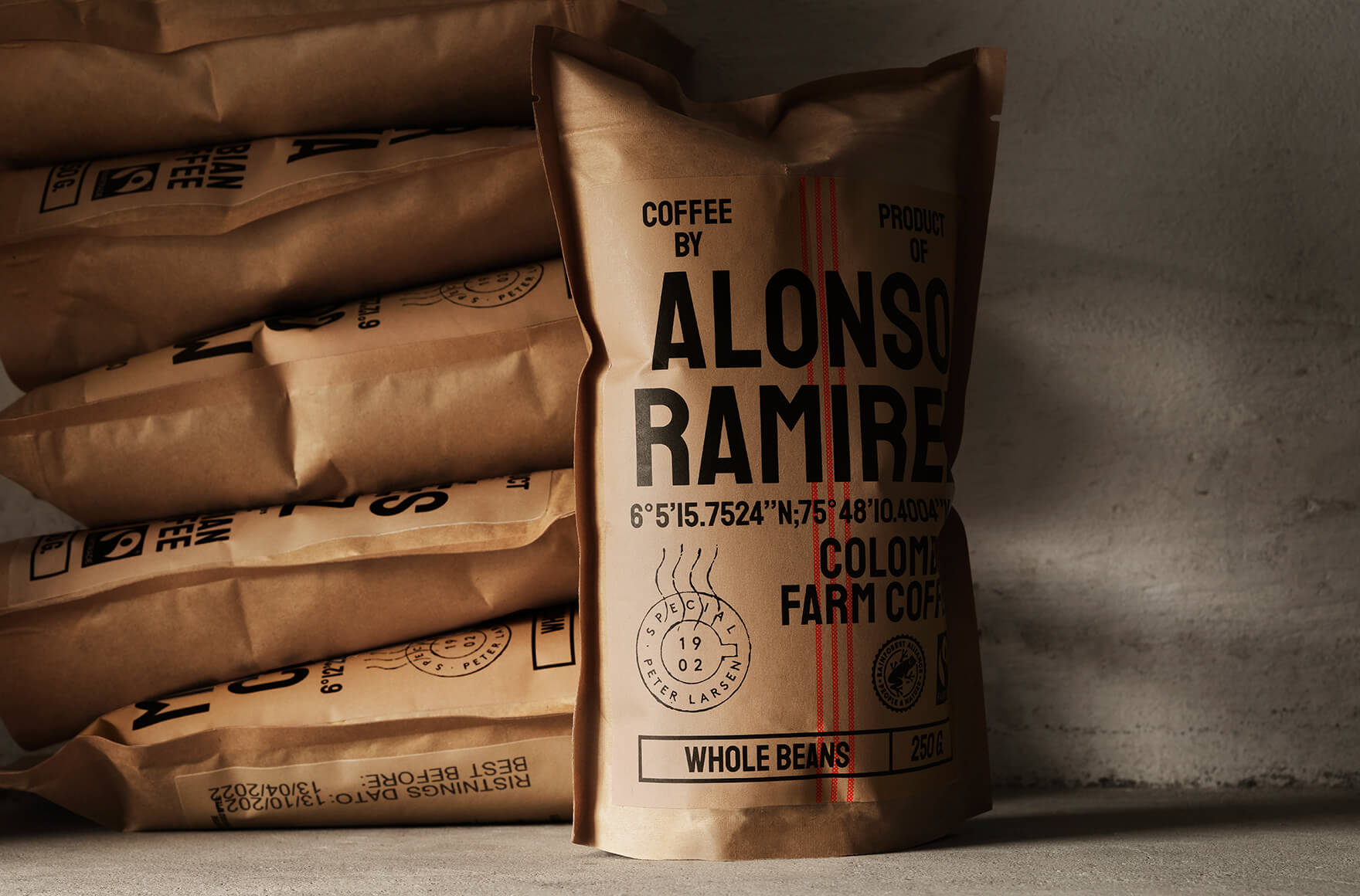
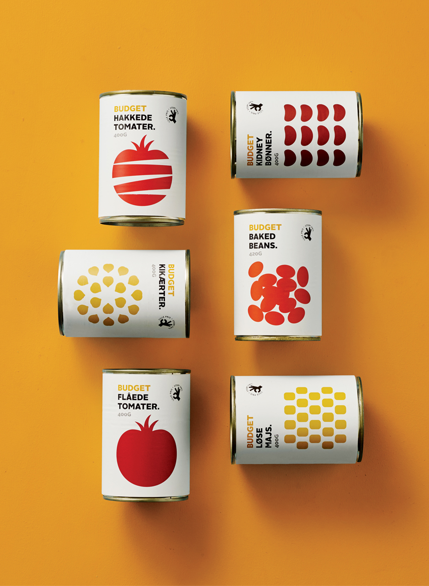
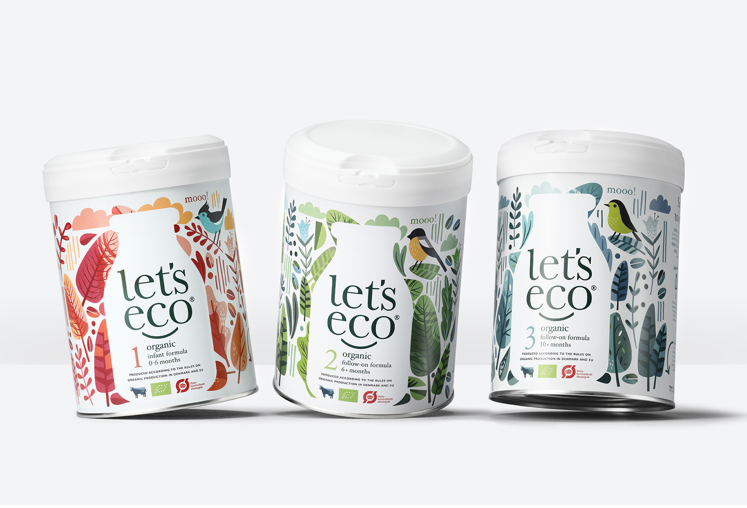
Packaging that speaks for itself
Them 1888


Never convetional